Fork me on GitHub
杨小慧的博客

天猫仿站:4产品页面——基本详情

产品页面之基本详情页中用到的“左边固定,右边自动占满”布局。相应的写一“左右固定,中间自适应”布局。
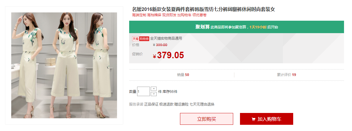
预览地址

1. 左边固定,右边自动占满

1
2
3
4
5
6
7
8
9
10
11
12
13
14
<style>
.left{
width:200px;
float:left;
background-color:pink
}
.right{
overflow:hidden;
background-color:lightskyblue;
}
</style>
<div class="left">左边固定宽度</div>
<div class="right">右边自动填满</div>

效果预览

2. 左右固定,中间自适应的布局(浮动)

1
2
3
4
5
6
7
8
9
10
11
12
13
14
15
16
17
18
19
20
<style>
.left{
width:200px;
float:left;
background-color:pink
}
.right{
width:200px;
float:right;
background-color:pink
}
.center {
margin:0 200px;
background-color:lightblue
}
</style>
<div class="left">左边固定宽度</div>
<div class="right">右边固定宽度</div>
<div class="center">中间自适应</div>

效果预览

这里需要注意三个div的顺序:左-右-中,中间的div最后写,如果写在中间,会发生什么呢?

我来瞧瞧发生了什么

可以看见最后一个div掉下去了,这是因为中间的div没有设置浮动,放在中间div后面的div会换行。下面介绍用position定位实现这种布局。

3. 左右固定,中间自适应的布局(定位)

1
2
3
4
5
6
7
8
9
10
11
12
13
14
15
16
17
18
19
20
21
22
23
24
25
26
27
28
<style>
* {
padding:0;
margin:0;
}
.left{
position: absolute;
left: 0;
top: 0;
width: 200px;
background-color: pink;
}
.center{
margin: 0 200px;
background-color: lightblue;
}
.right{
position: absolute;
top: 0;
right: 0;
width: 200px;
background-color: pink;
}
</style>
<div class="left">左边固定宽度</div>
<div class="center">中间自适应</div>
<div class="right">右边固定宽度</div>

效果预览

这种布局就和div的顺序无关了。

------本文结束感谢阅读------